
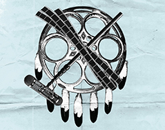
Concept
‘Independent’ means going against the grain, “doing it yourself,” and saying ‘no’ to the status quo. Independent film makers have touched us in ways that excessive hollywood budgets and well groomed A-list celebrities could never understand. Independent is rough around the edges. Independent is punk rock. Unpolished, stripped of shiny things and perfect edges, this campaign demonstrates the DIY spirit of independent film. Distilled, but not diluted, the visuals communicate Oklahoma roots and independent pride.
Style
Pared down, “with what’s available” styled imagery, and monochromatic images communicate a hand-crafted, noncommercial, independent message.
- Black and white, high contrast images symbolize low cost, “took my flyers to the copy shop and assembled them myself,” appeal.
- Creased, worn paper communicates non-commercial quality.
- Super 8 cameras, old film reels, and collaged Oklahoma-eque imagery adds organic, retro look and feel.
deadCenter 13 – logo

deadCenter 13 – Poster

deadCenter 13 – ticket, passes, and banner ad
